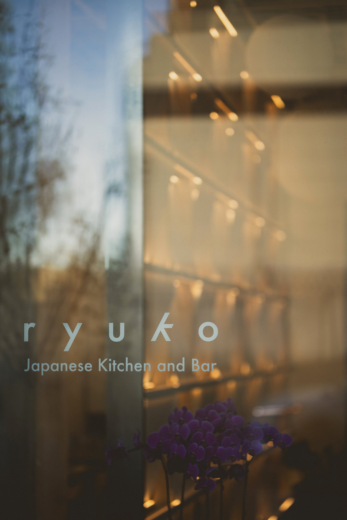
Ryuko Restaurant
A restaurant interior inspired by the textures of Tokyo, grounded in Calgary’s Beltline
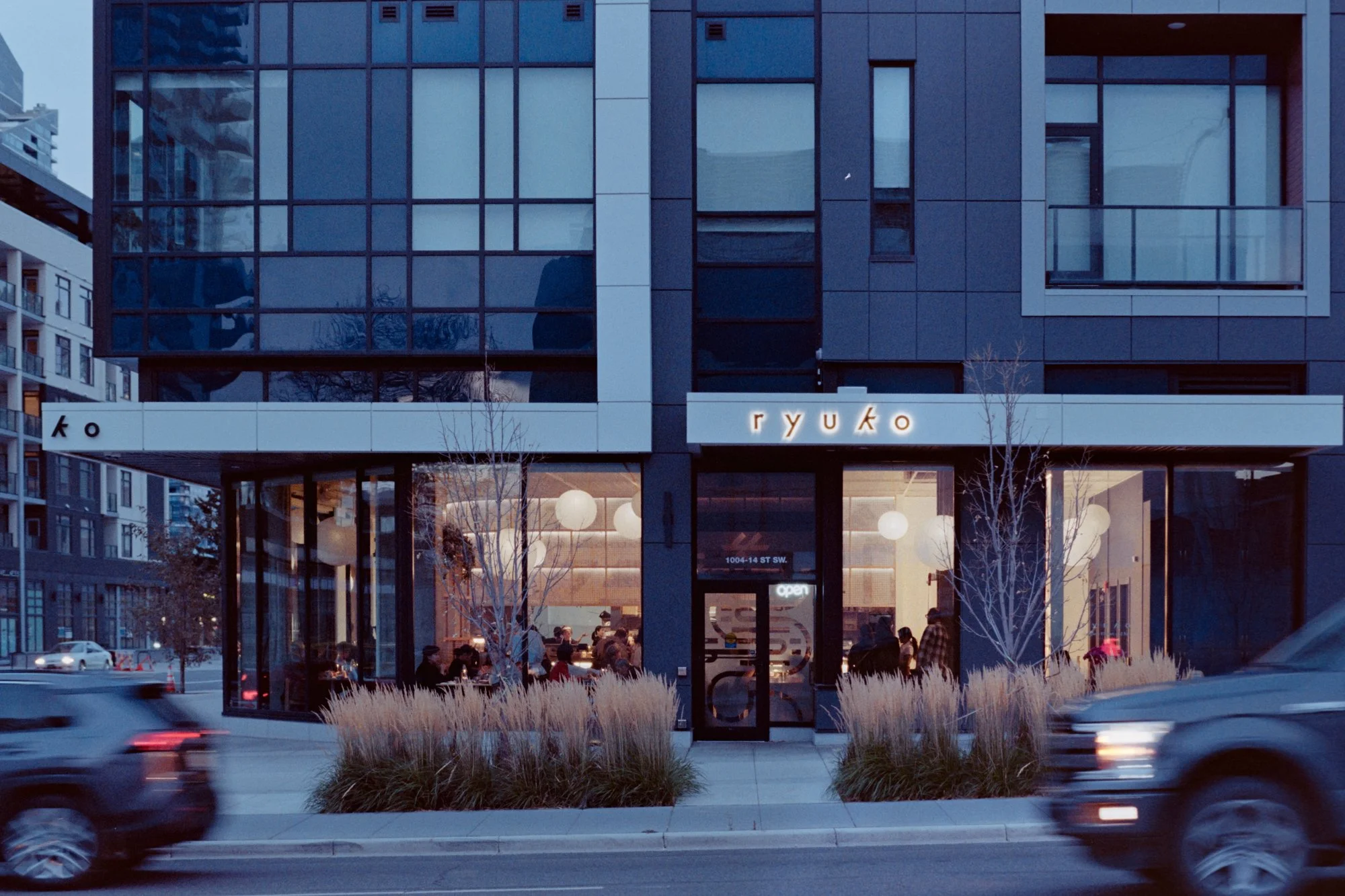
Location 1004 14th Steet SW, Beltline, Calgary
Size 3,084 sq. ft
Status Completed
Status Completed
Ryuko Japanese Kitchen + Bar is a restaurant shaped by movement, layering, and material inspiration. The design draws from the textures of Tokyo: alleys, signage, soft thresholds, and shifting light. It references both Japanese craft and the informal order of the street, where rhythm and contrast guide the experience.
The result is a space that unfolds as a continuous composition, a collage of the city’s facades.
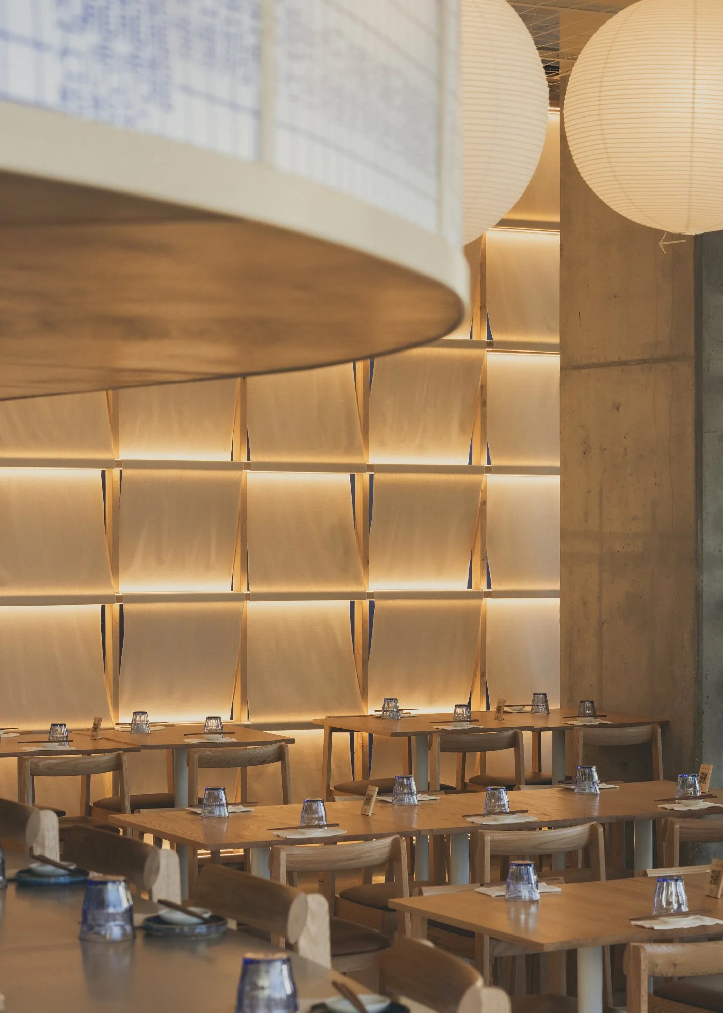
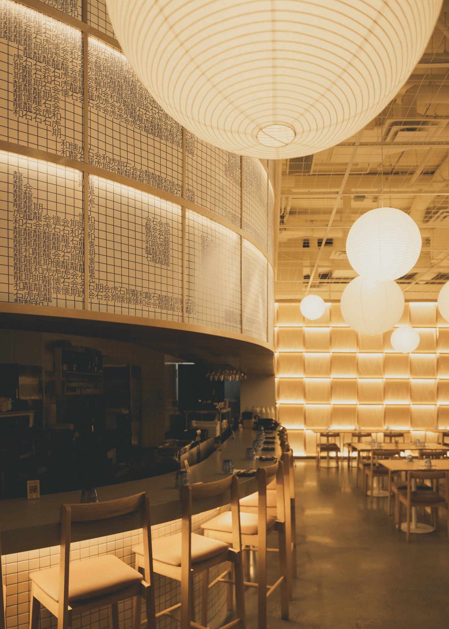
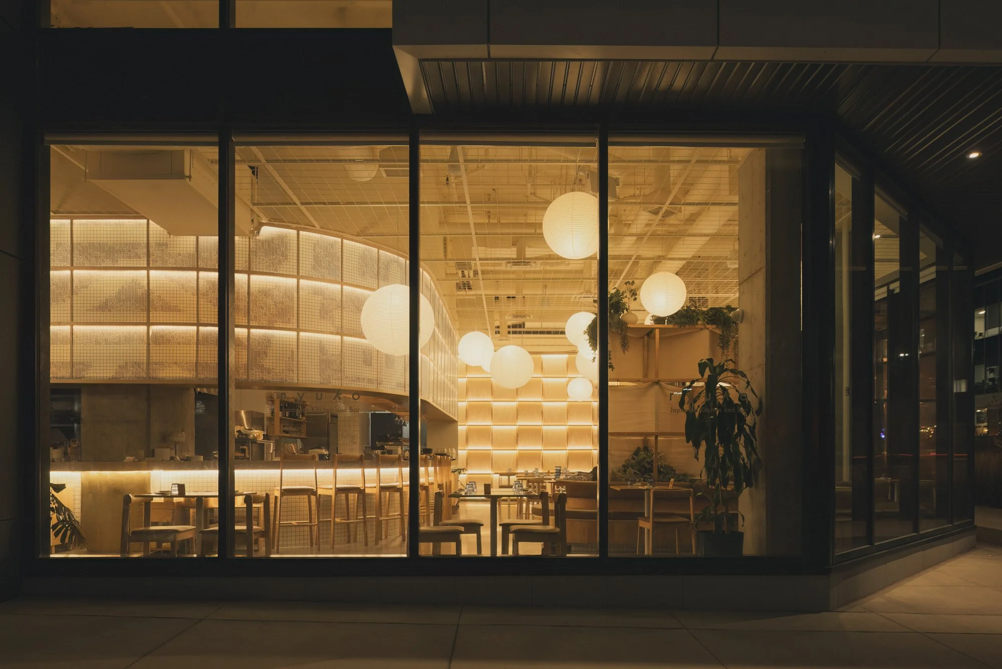
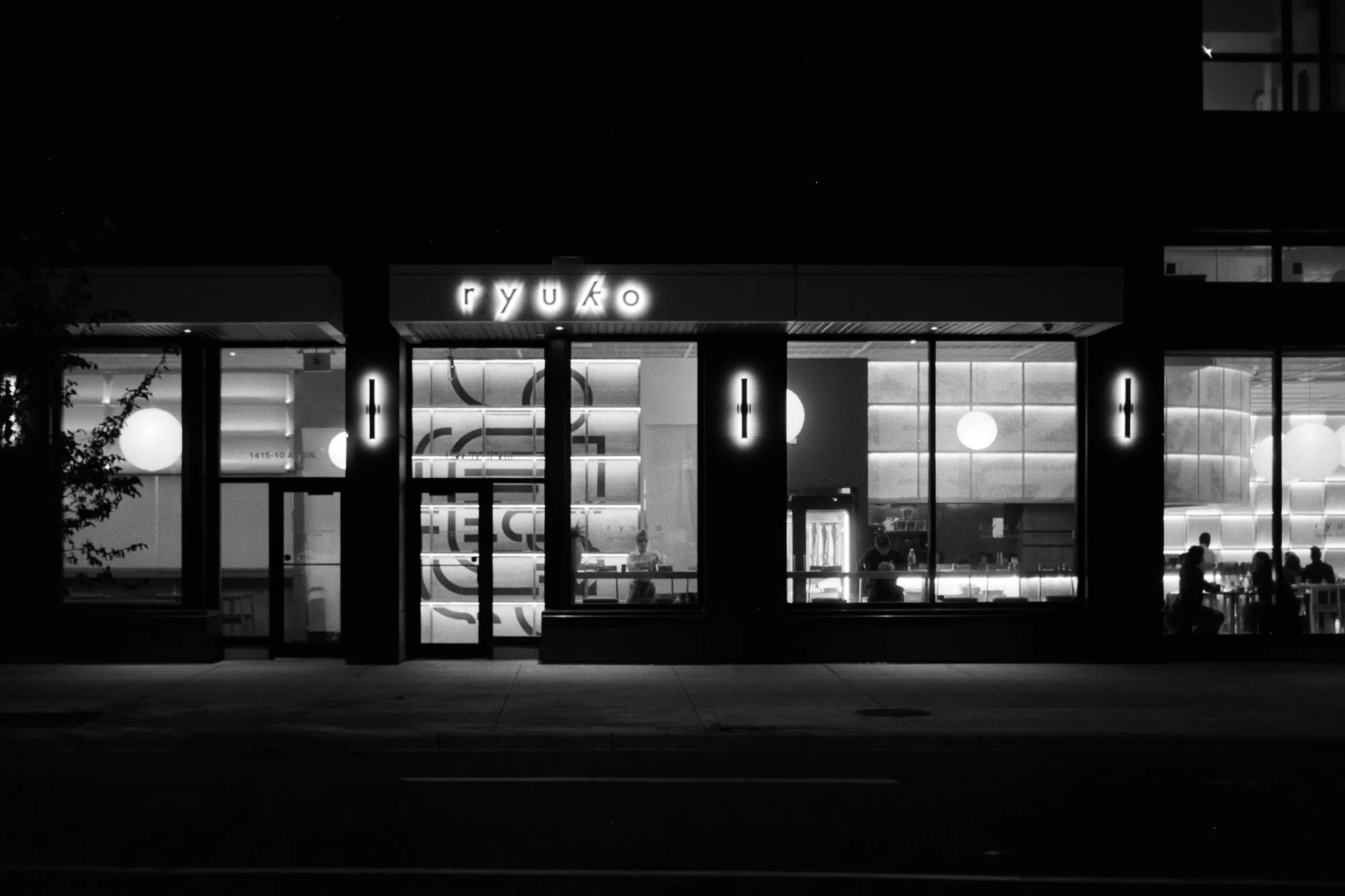
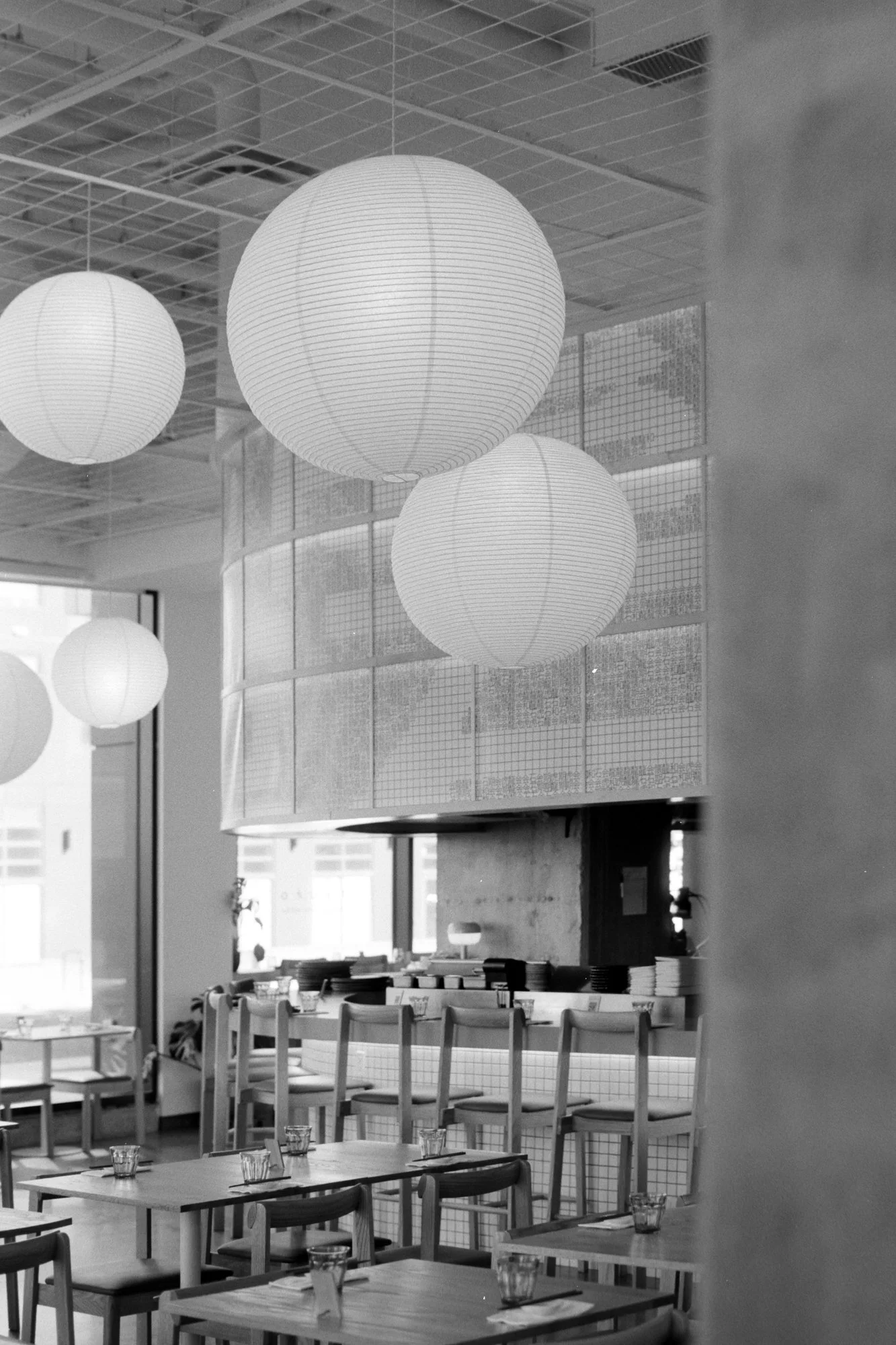
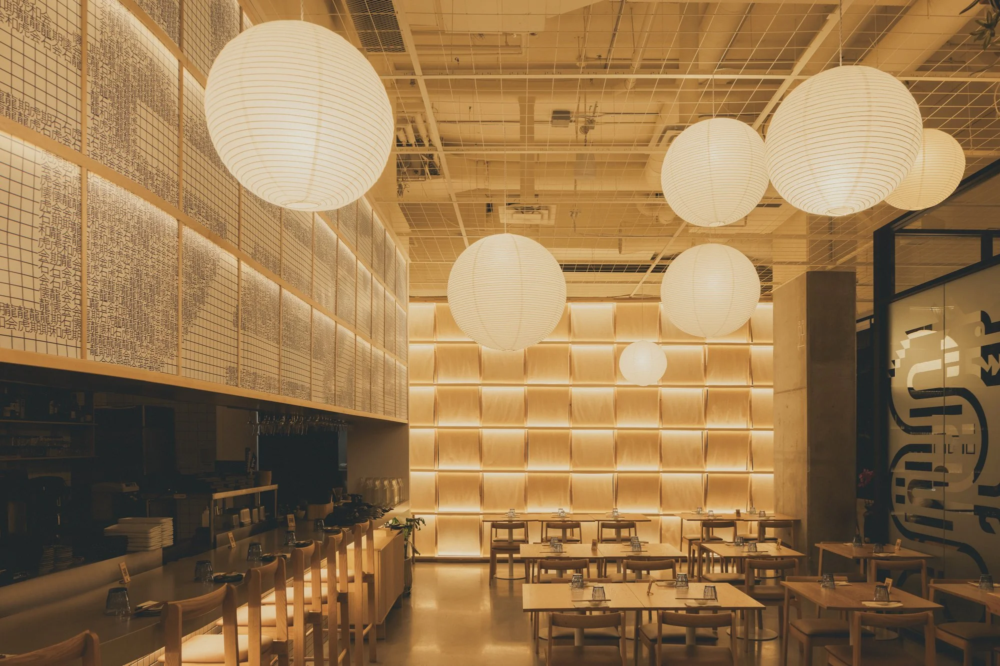
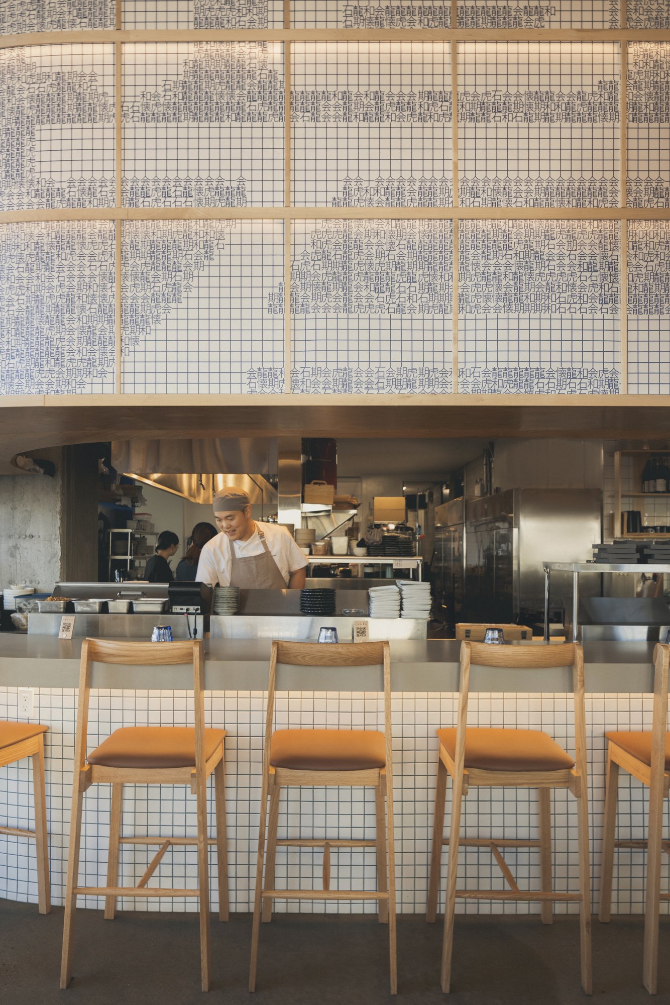
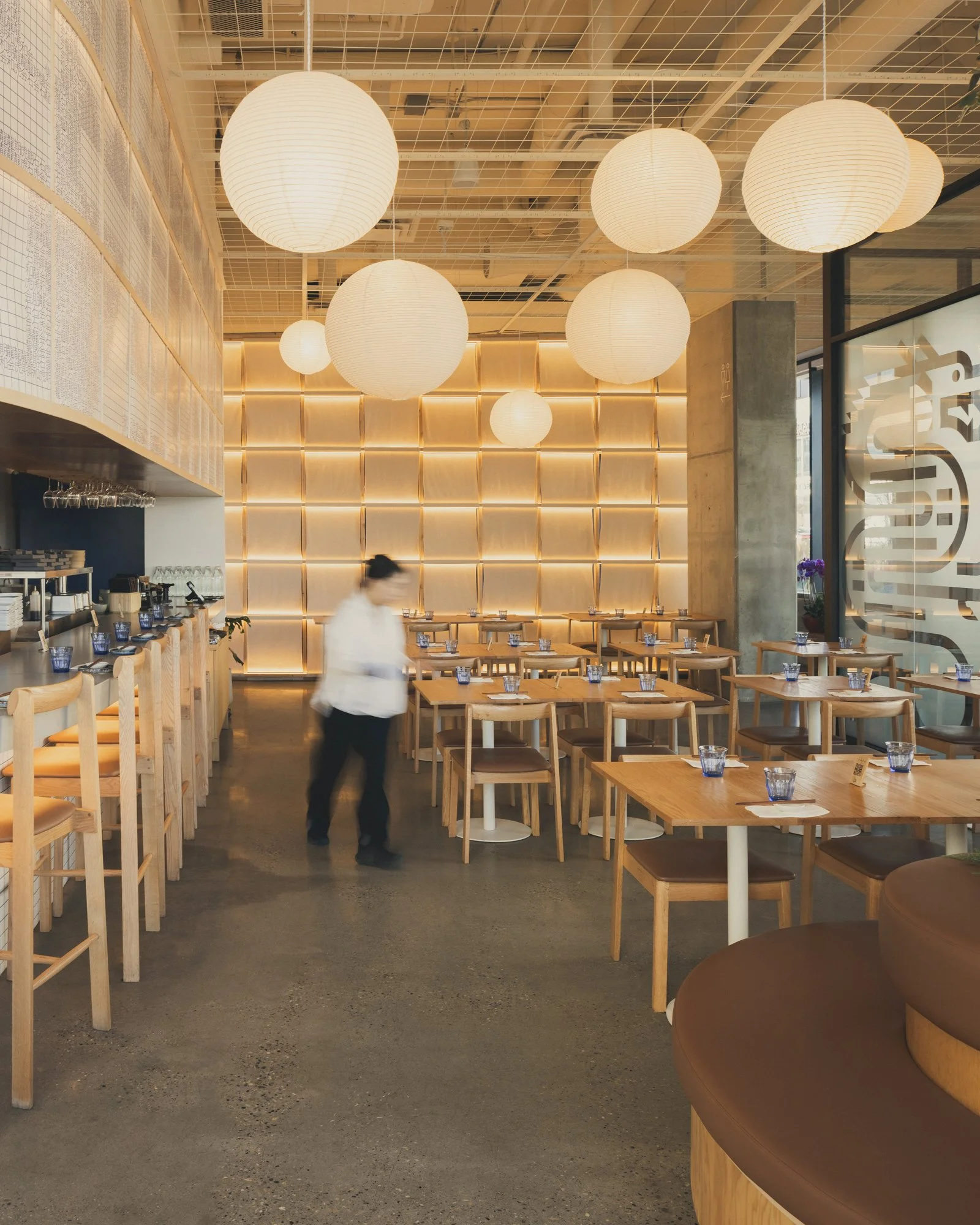
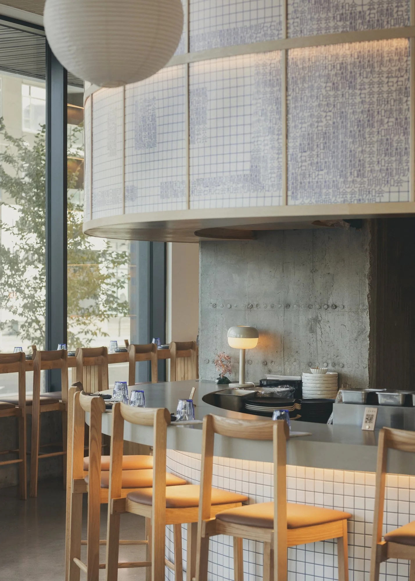
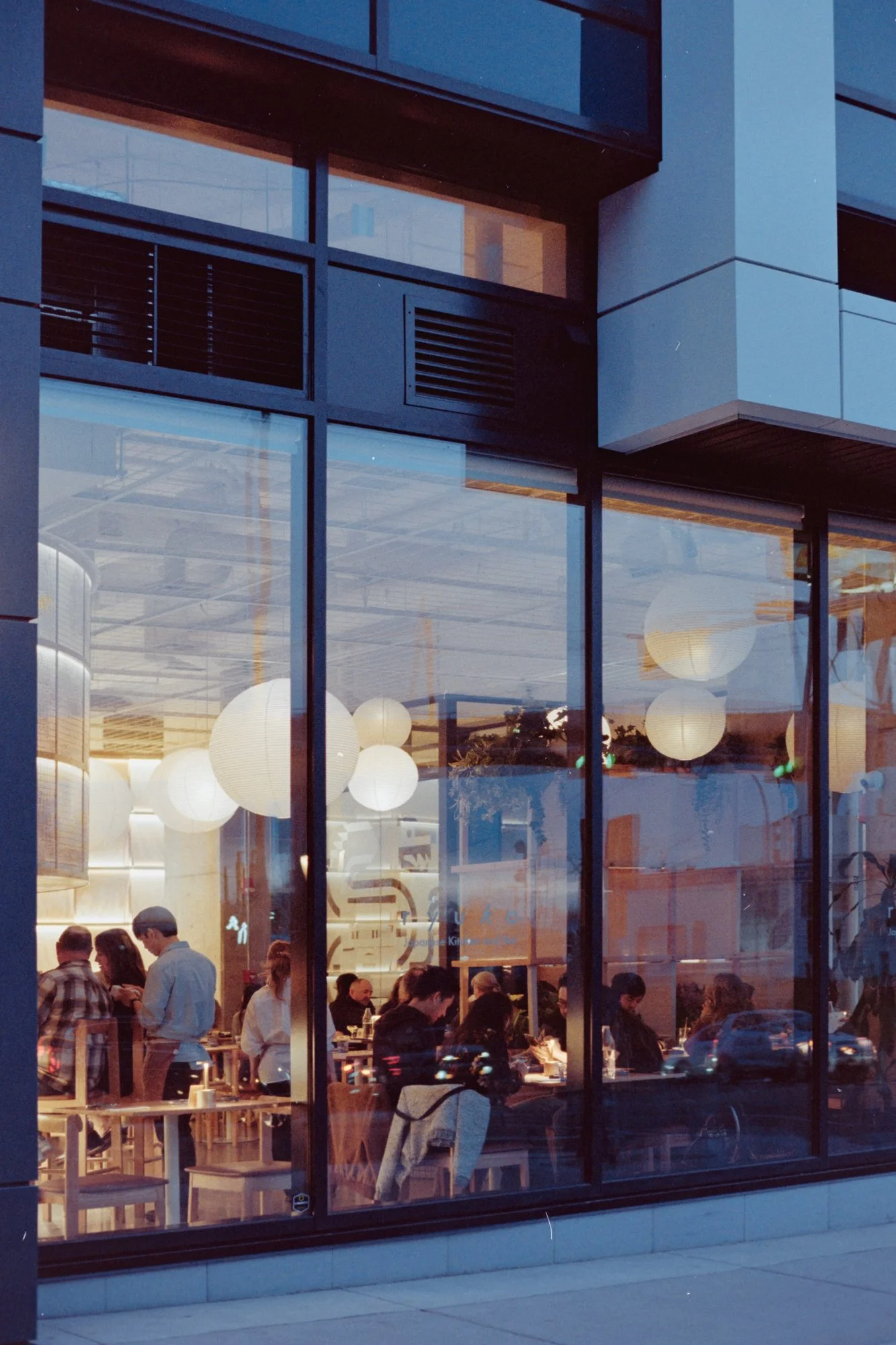
The building engages the street directly. A long, curving bar wraps the corner, visible from the sidewalk and the passing C-Train. It works with the glazing to pull the interior into the public realm. Overhead, a band of cabinetry above the bar doubles as signage, casting a soft, filtered glow across the dining room.
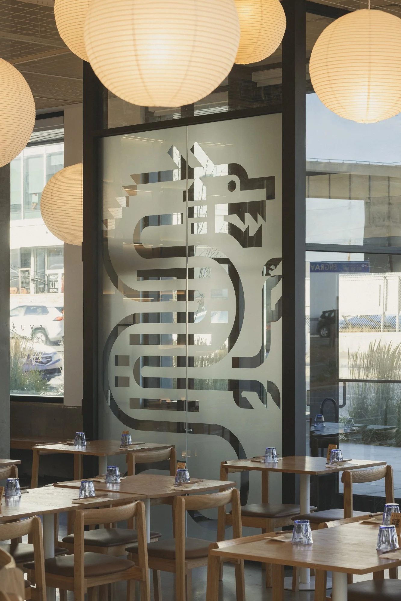
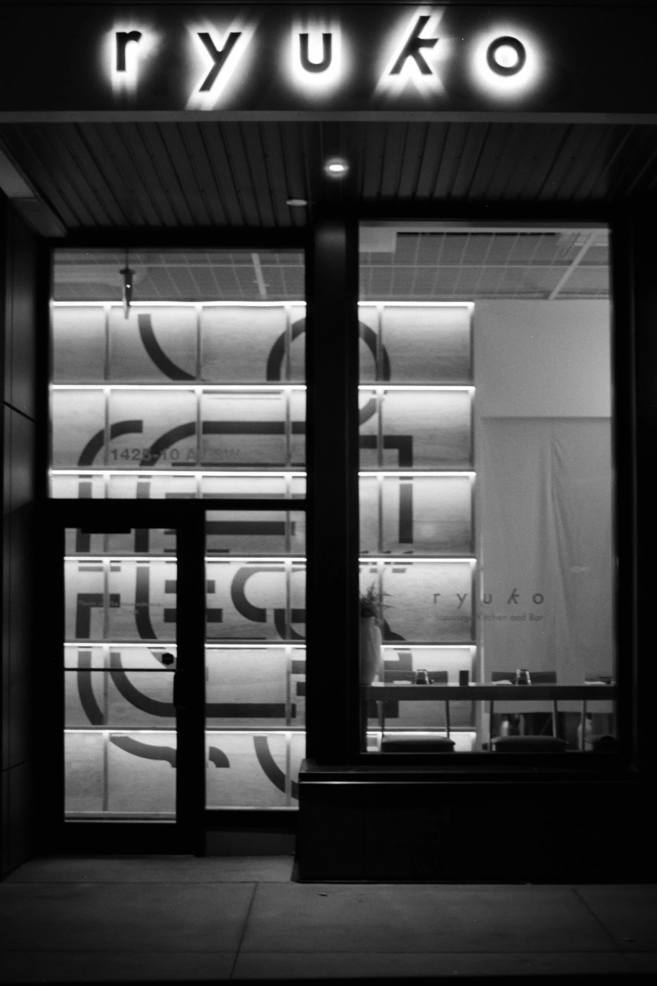
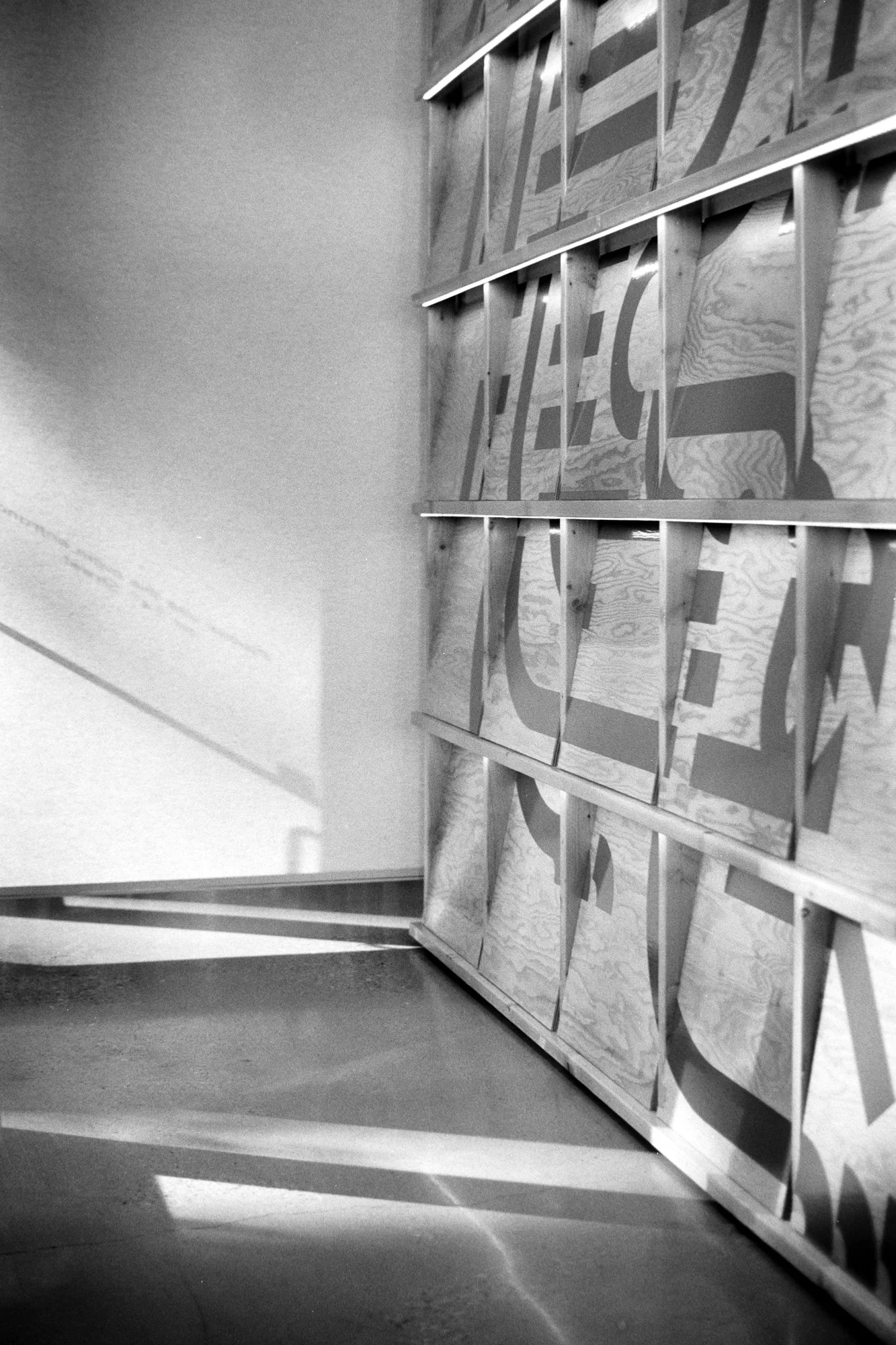
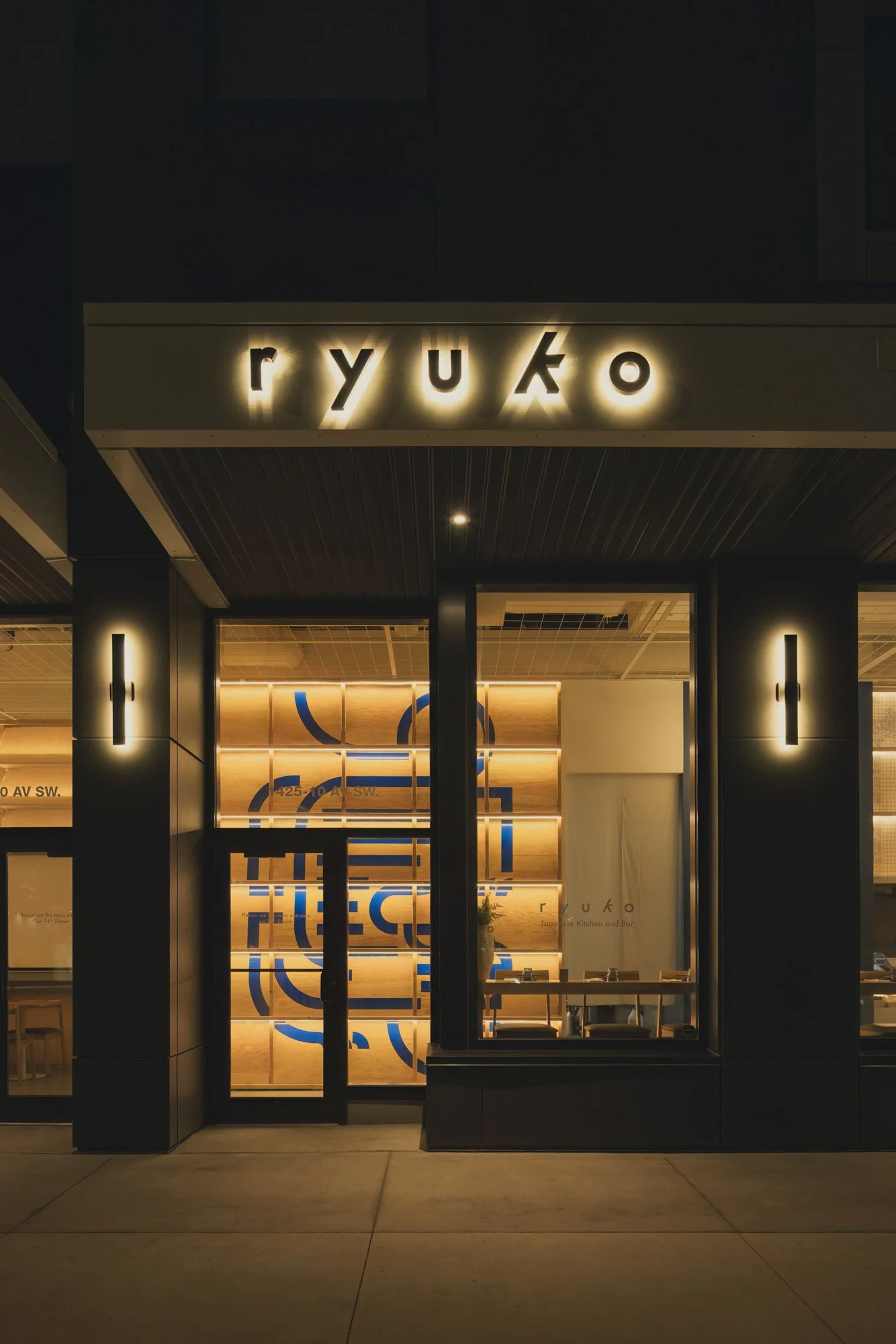
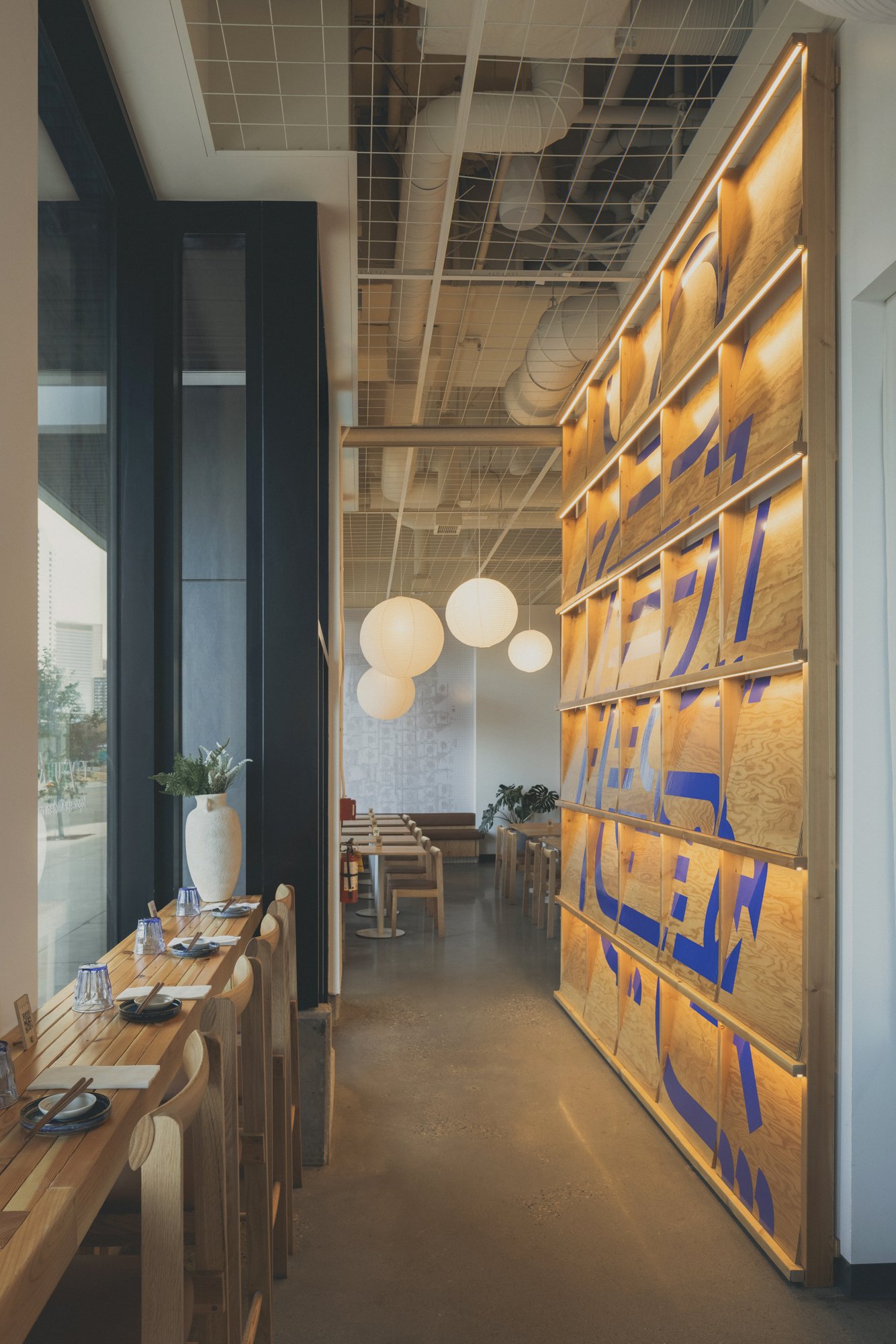
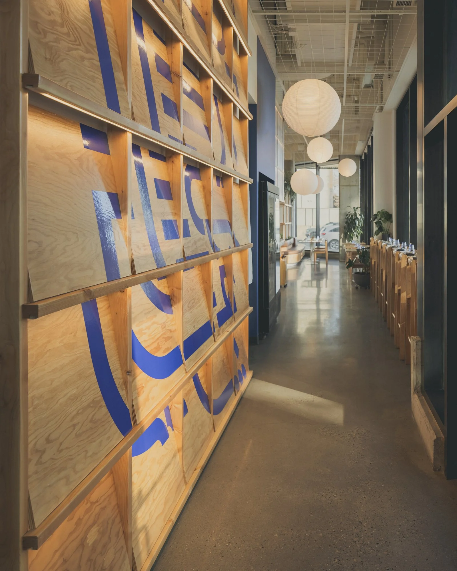
At the entries, large-scale graphics mark the threshold: a dragon pressed into the vestibule glass, a tiger printed on warm wood paneling. These symbols, drawn from Ryuko’s identity, are carried throughout the project as recurring spatial markers.
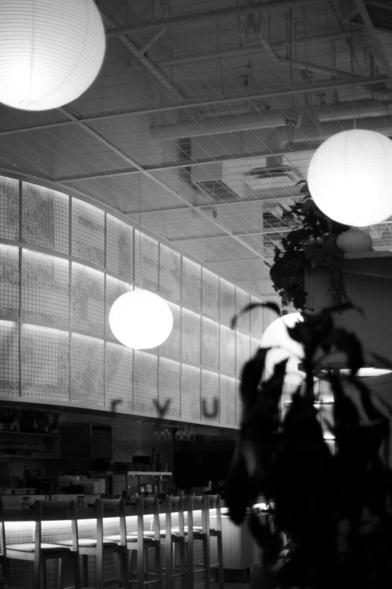
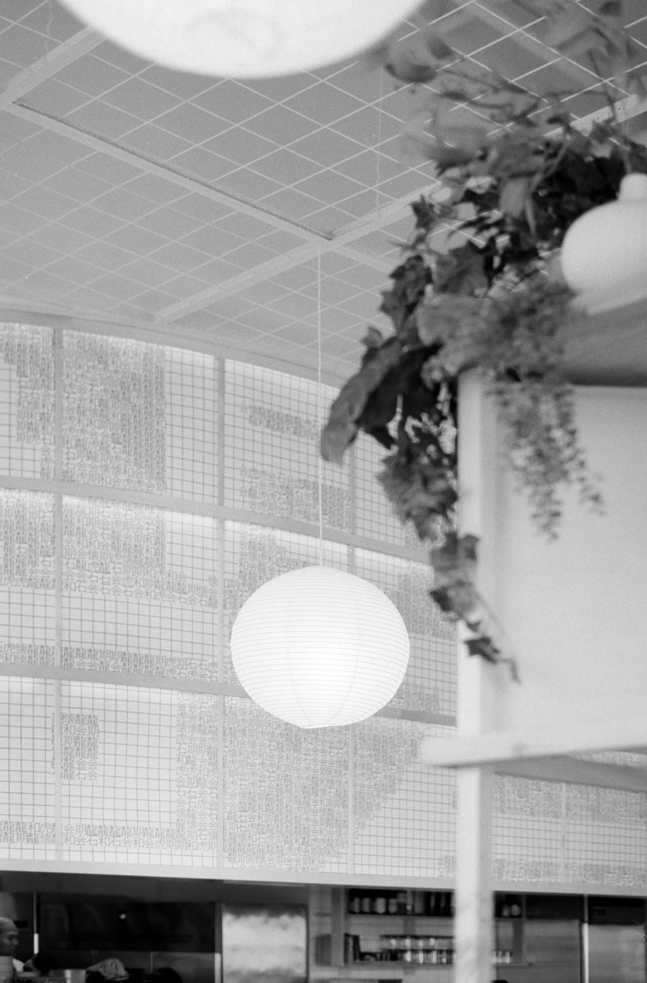
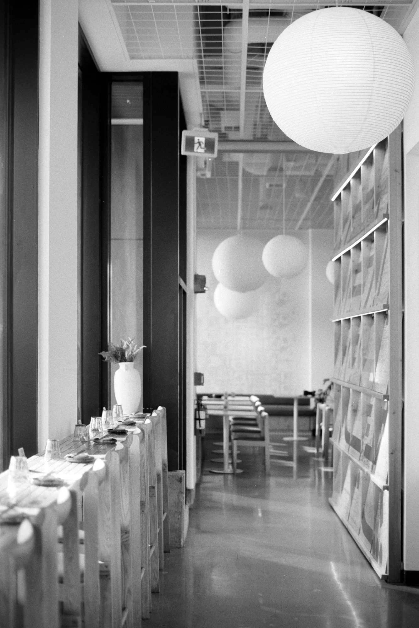
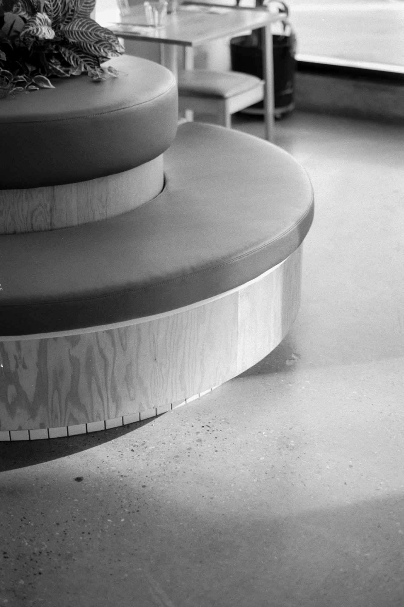
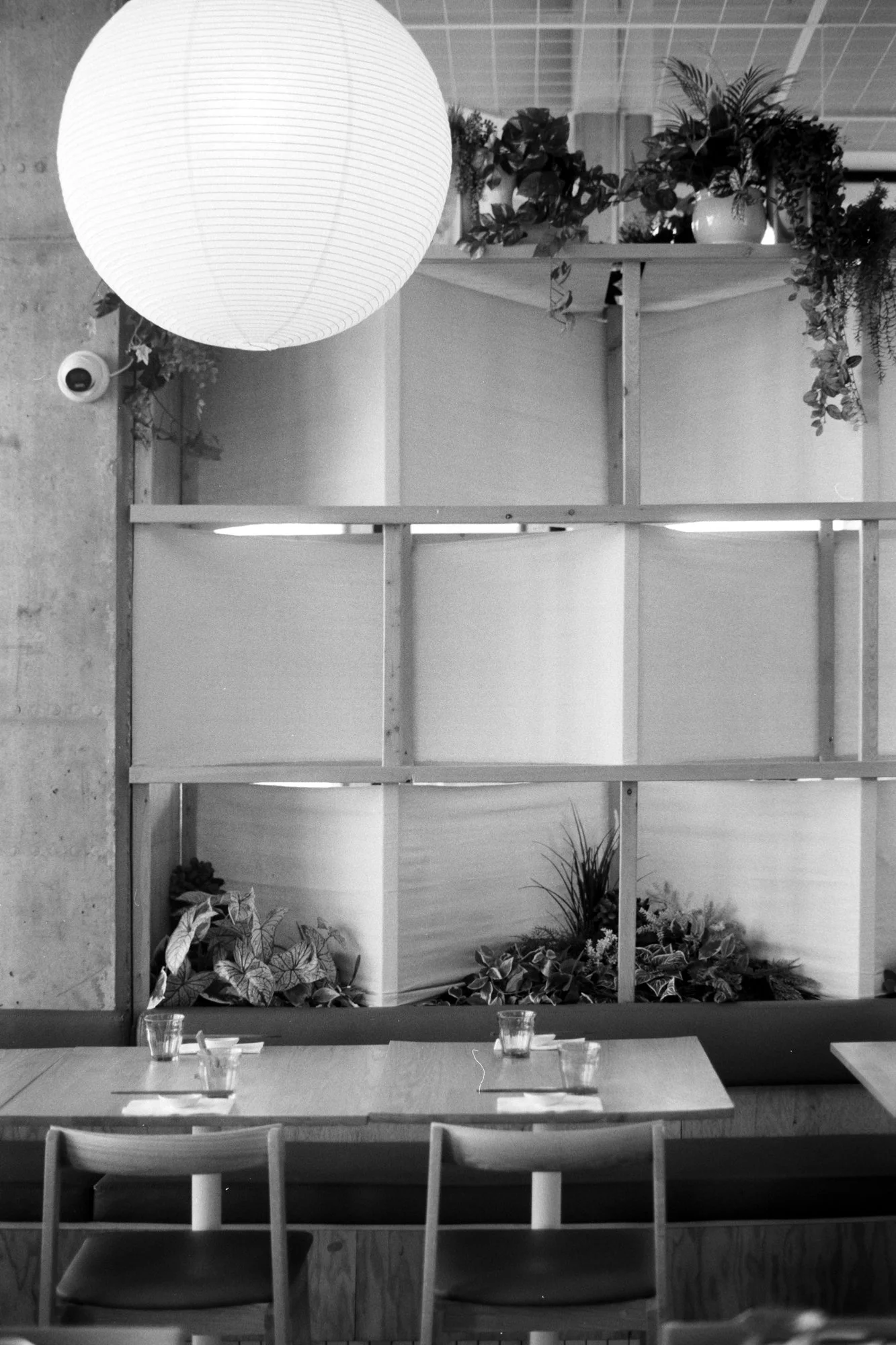
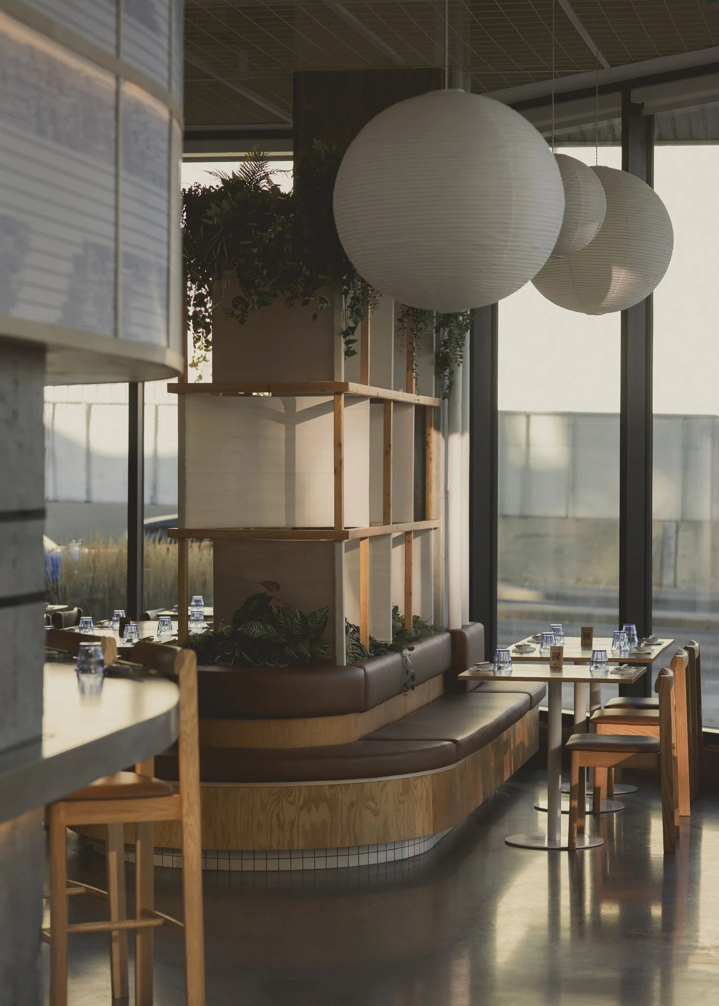
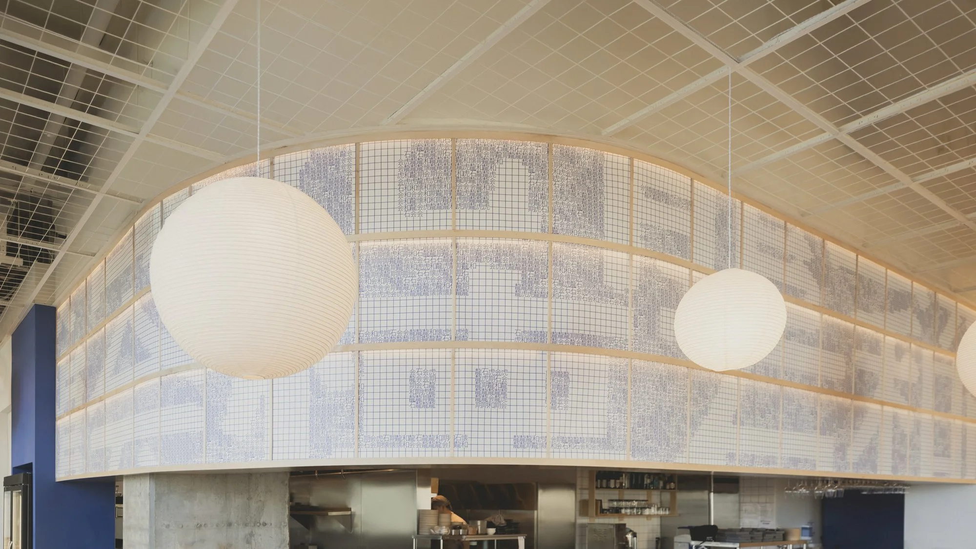
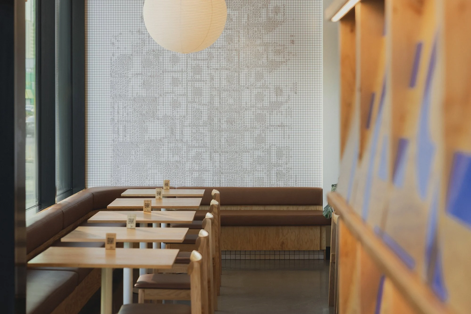
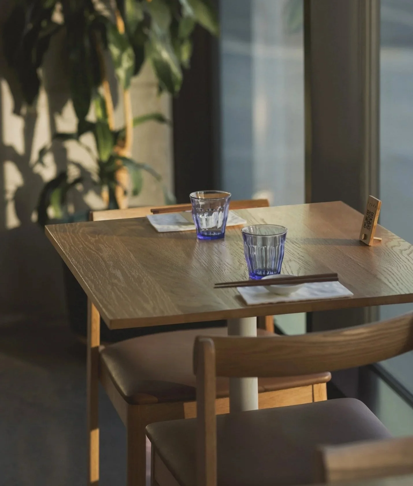
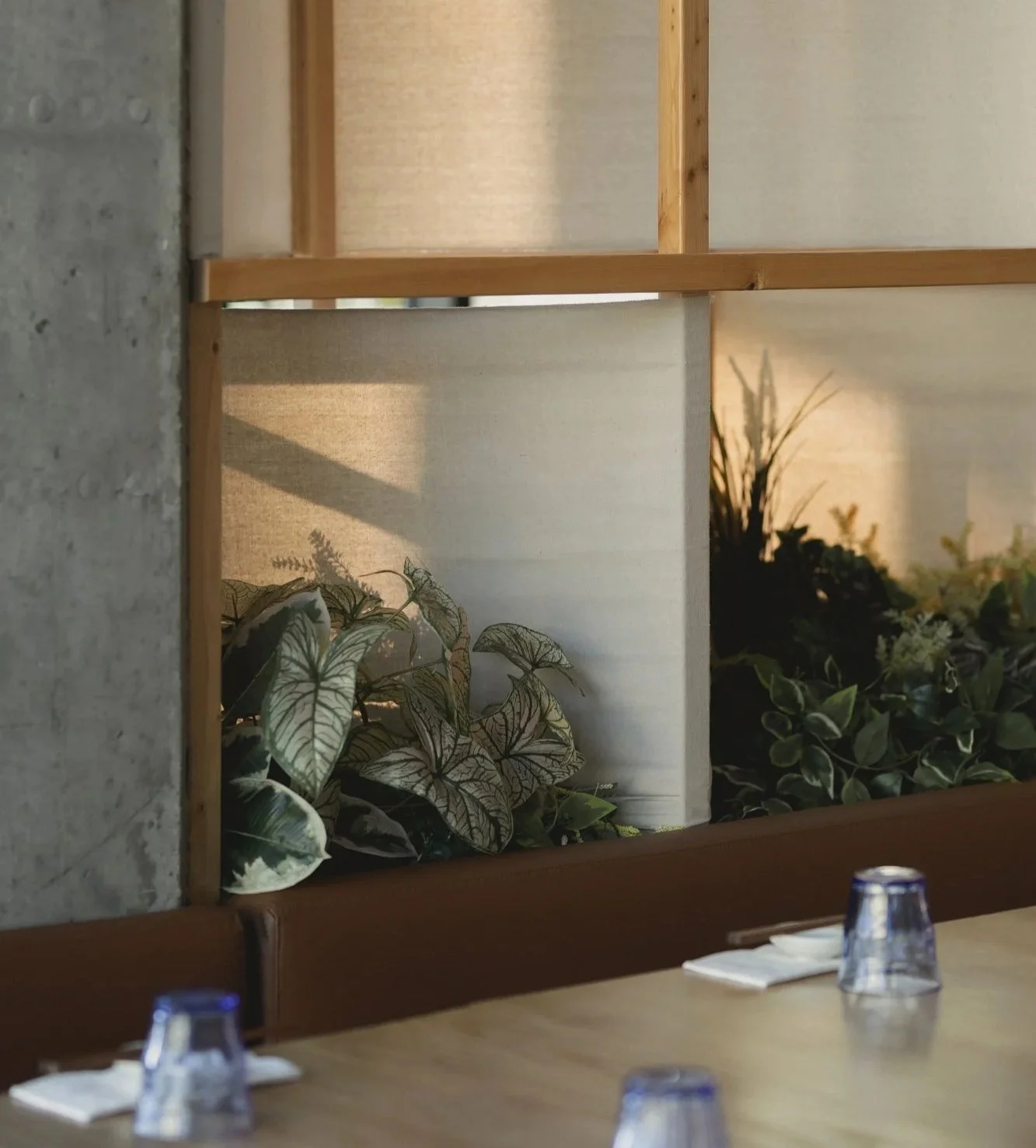
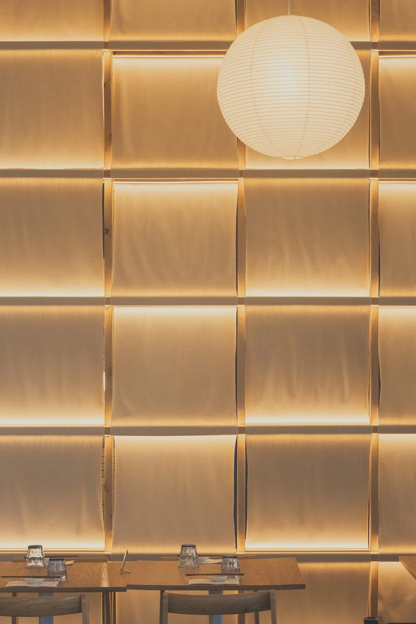
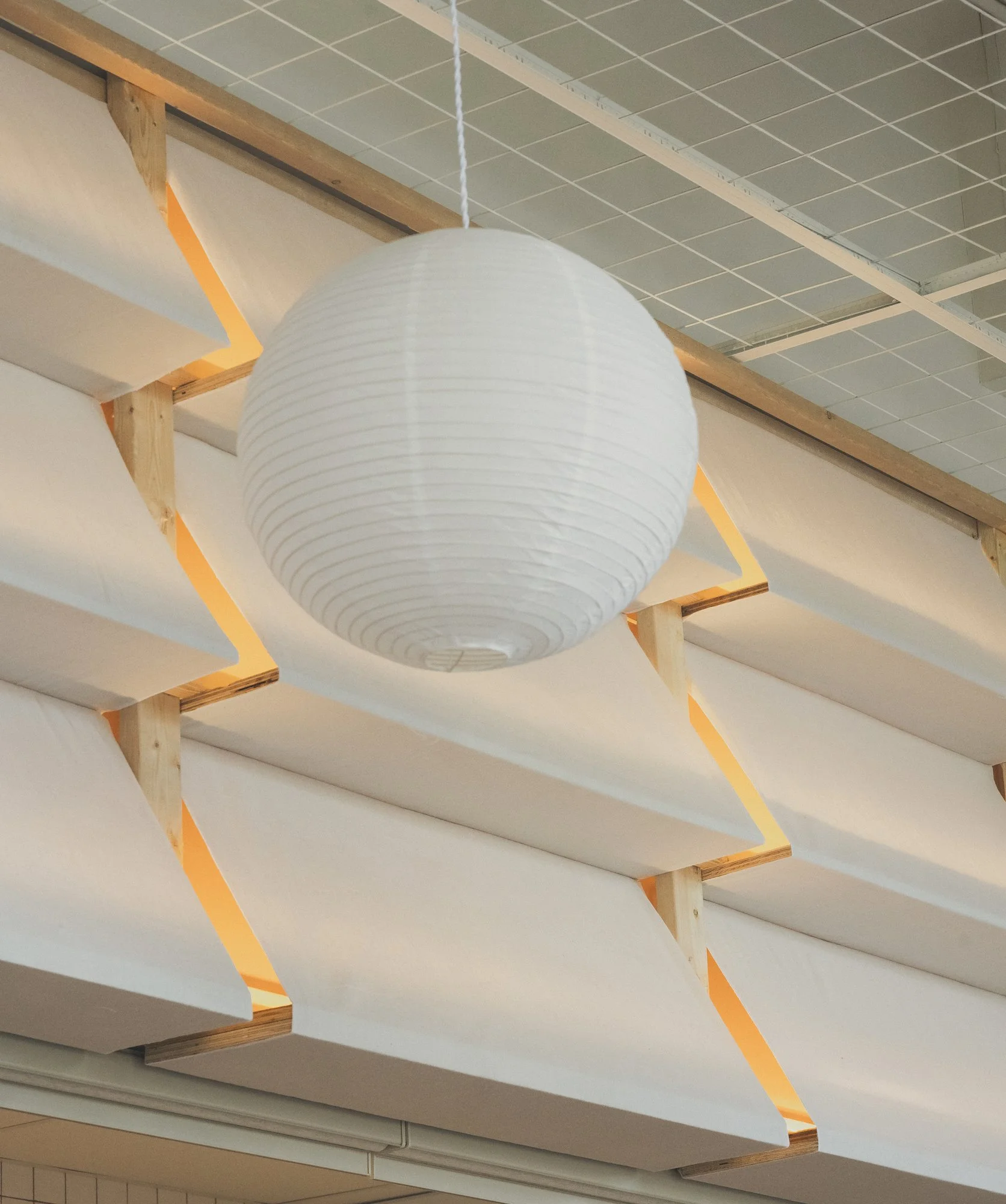
Inside, the curved bar anchors the dining room and draws the eye across the plan. Seating is varied and intentionally arranged to support different ways of gathering. Some areas feel open and animated , others more quiet and contained. The architecture reinforces this balance. Canvas screens stretch and fold along the walls, creating soft enclosures and filtering light, like noren curtains in alleyway stalls. Lanterns are suspended overhead in loose formation, adding rhythm without dividing the space.
The restaurant and bar occupy one side, the café the other, with a transitional zone connecting the two. The café is brighter and more flexible, designed for daytime use and small events. A continuous floating bar lines the window with low stools. The central passage functions like a side street , linking programs while creating smaller, quieter moments within the whole.
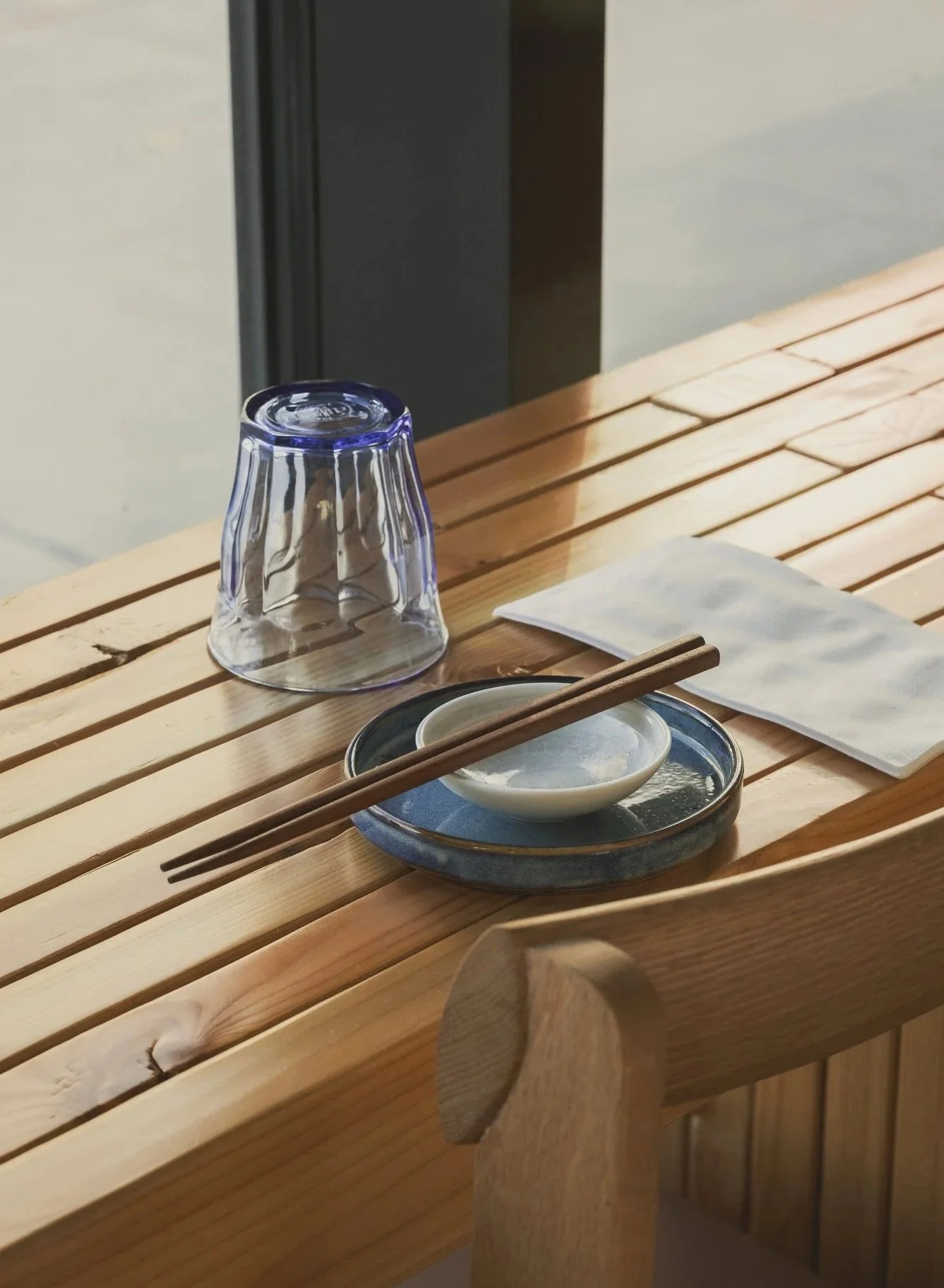
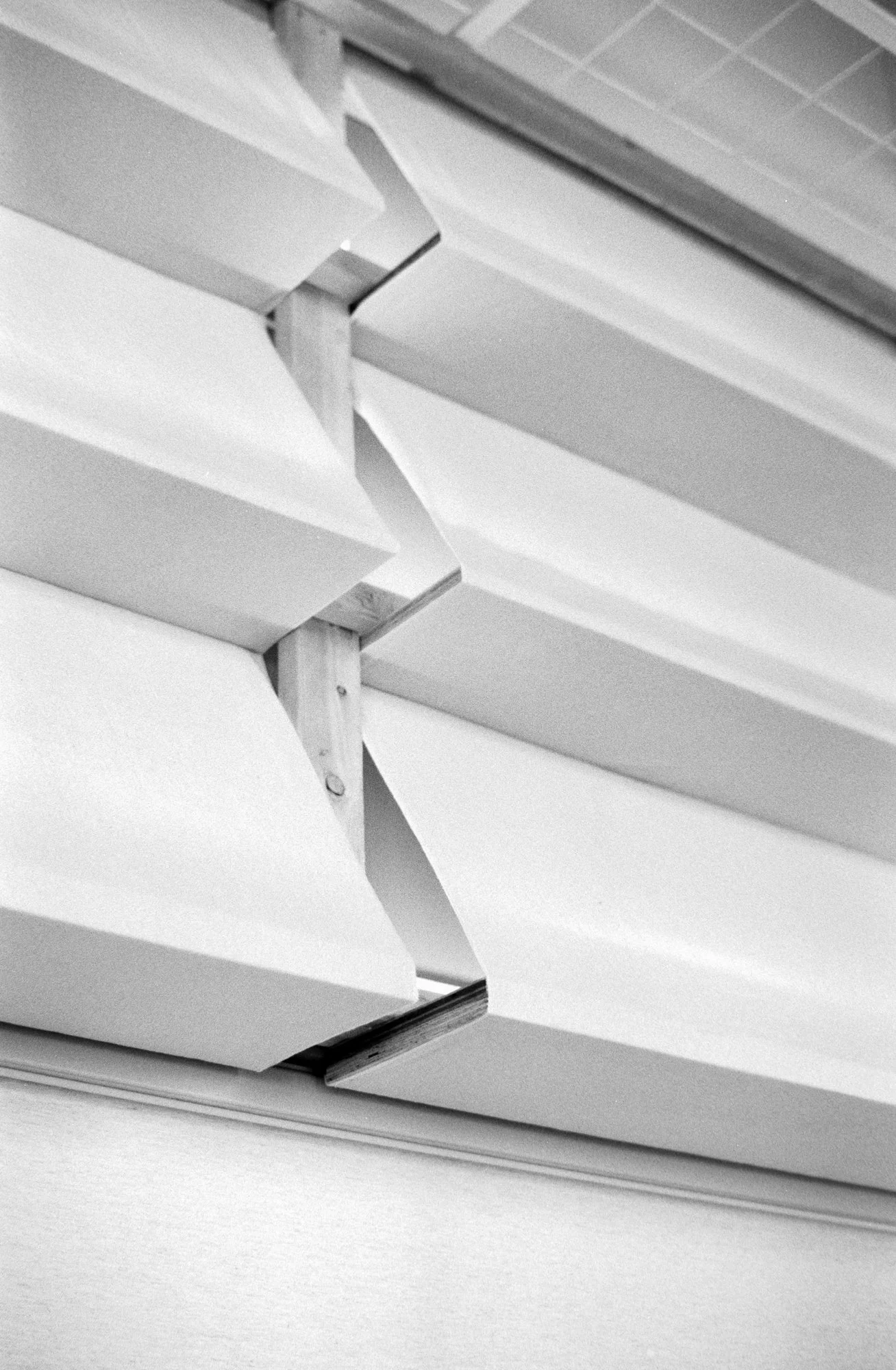
Materials carry a distinct sensibility. Canvas forms soft thresholds that shift with the light. Warm wood recalls traditional joinery, stacked and layered in ways that define space without enclosing it. Screens and signage are treated as architectural elements— legible, restrained, and integrated into the rhythm of the space.
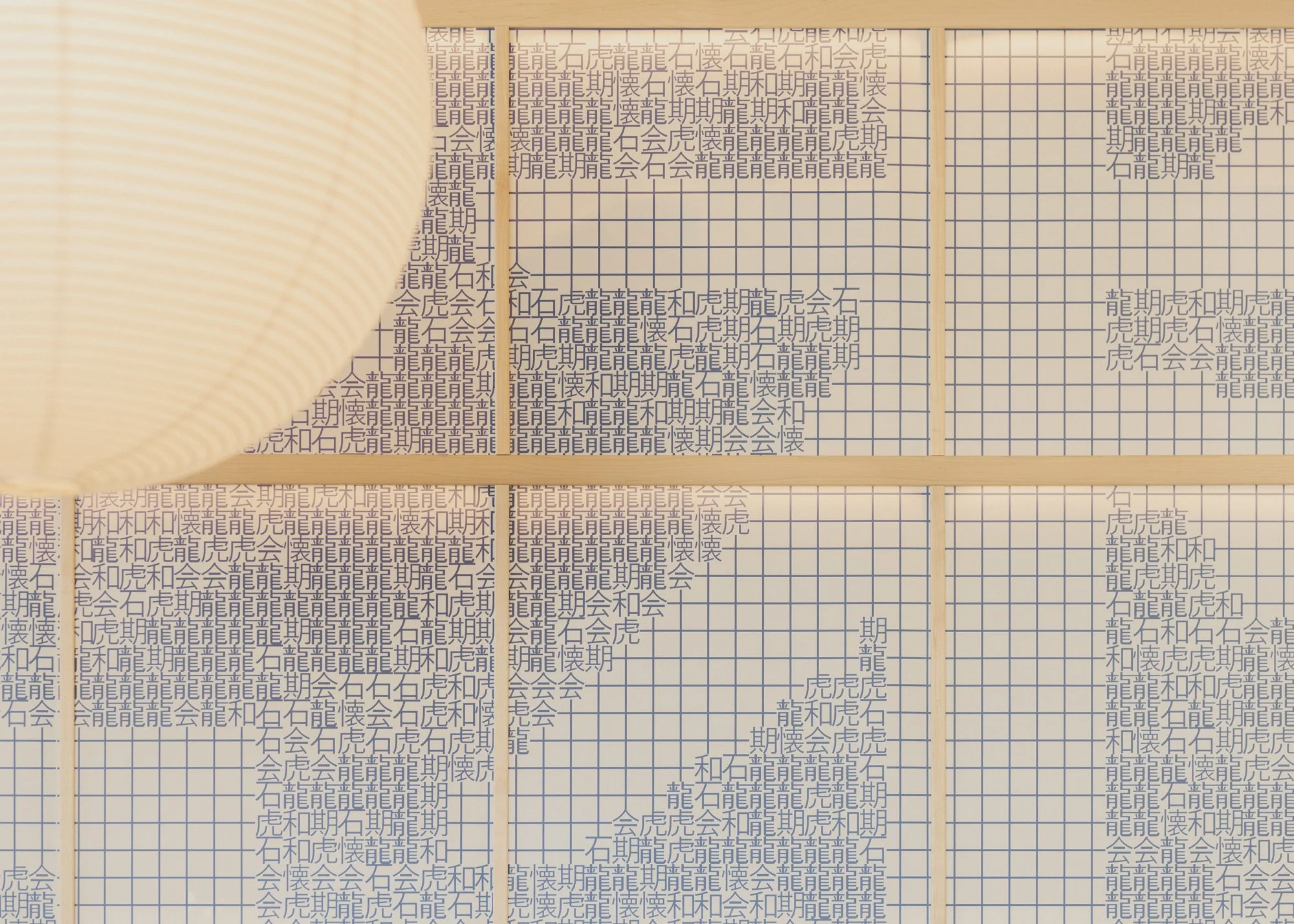
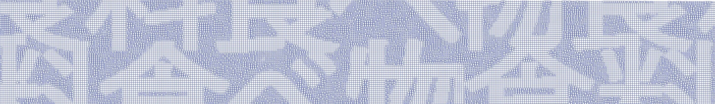
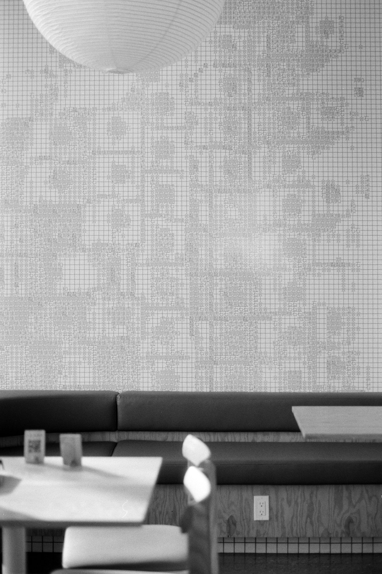
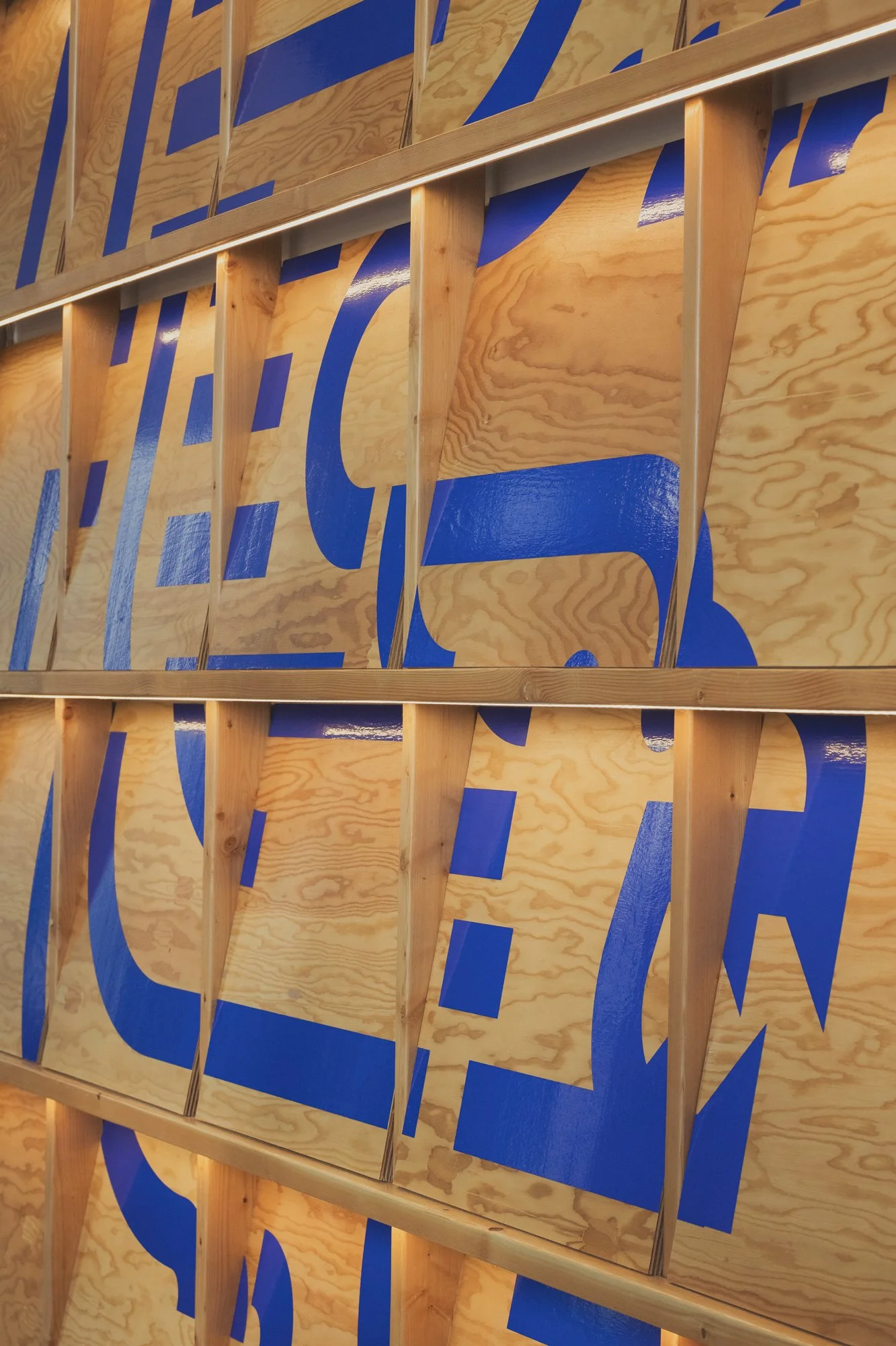
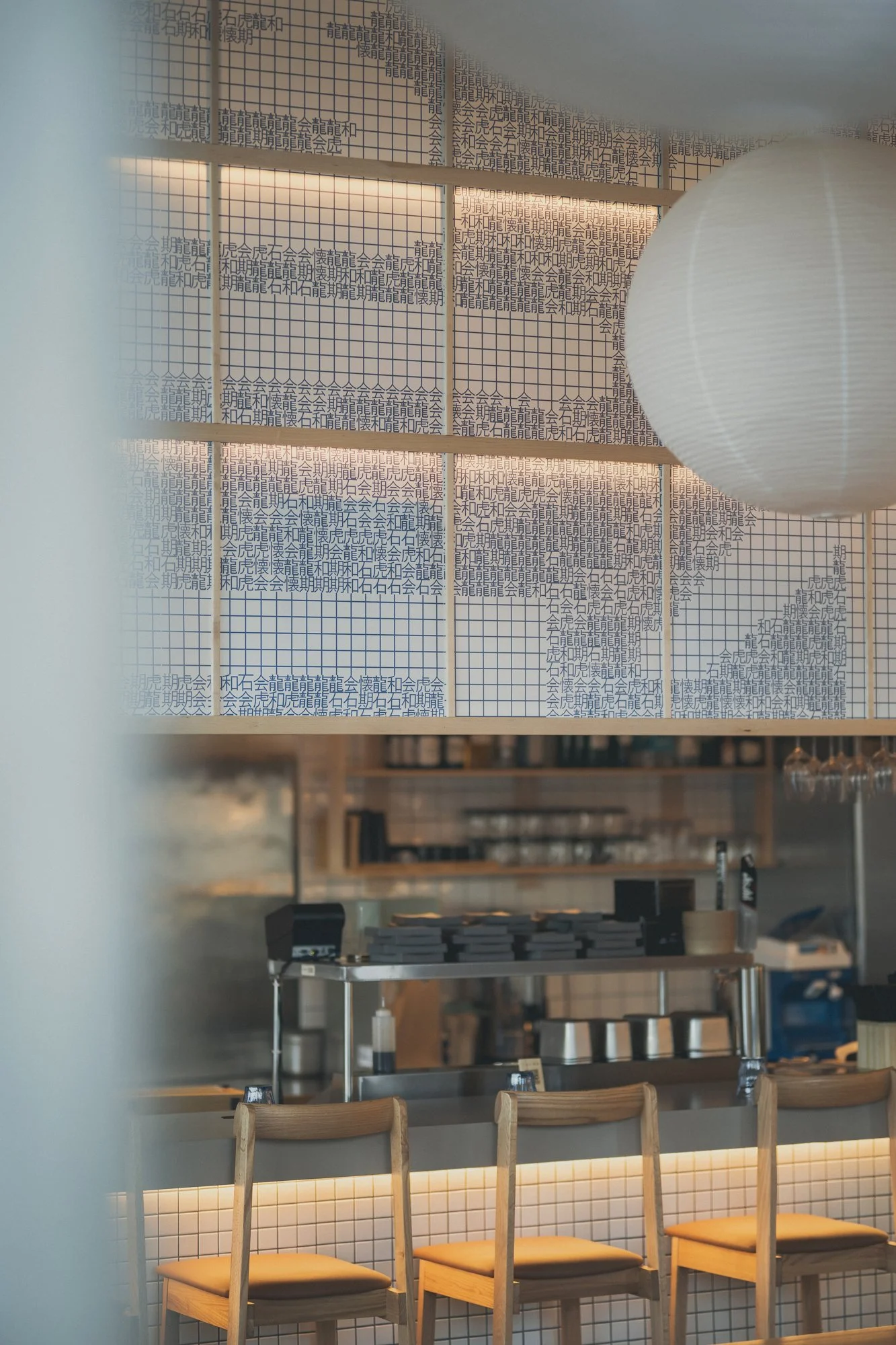
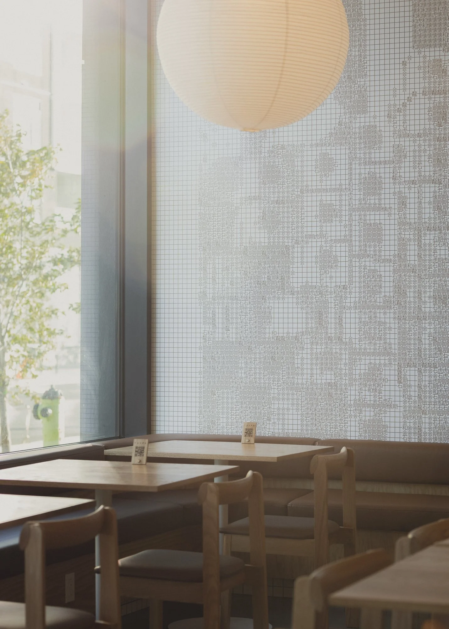
At the center of the signage system is a large-scale parametric surface composed of kanji characters. Each glyph—龍, 虎, 和, 懷—is mapped by tone and brightness to form a larger image that resolves at a distance. Up close, it reads as texture. From further back, it becomes structure.


The design avoids overstatement. Atmosphere comes through material, light, and pacing. It allows for stillness and compression alongside clarity and openness. The space holds back, leaving room for the experience to unfold.